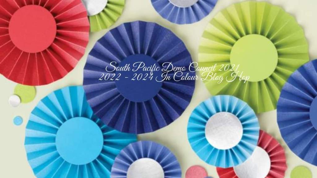
It’s Sale-a-bration time again which means for every NZ$110 you spend, you get to choose a free product from the Sale-a-bration catalogue. I am joining with my fellow South Pacific Demonstrator Council members from last year to showcase one of the Sale-a-bration products.
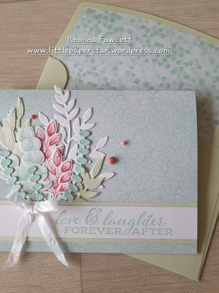
I have decided to show you the free notecard and envelope pack. They are gorgeous! I feel that the notecards are often overlooked and I want to persuade you as to why they are a good choice. They are called notecards but they are actually an American full sized card. Which means they are slightly higher than our South Pacific sized cards and not quite as wide. Here is a comparison photo…
The cards measure 14 x 10.8 cm when folded in half.
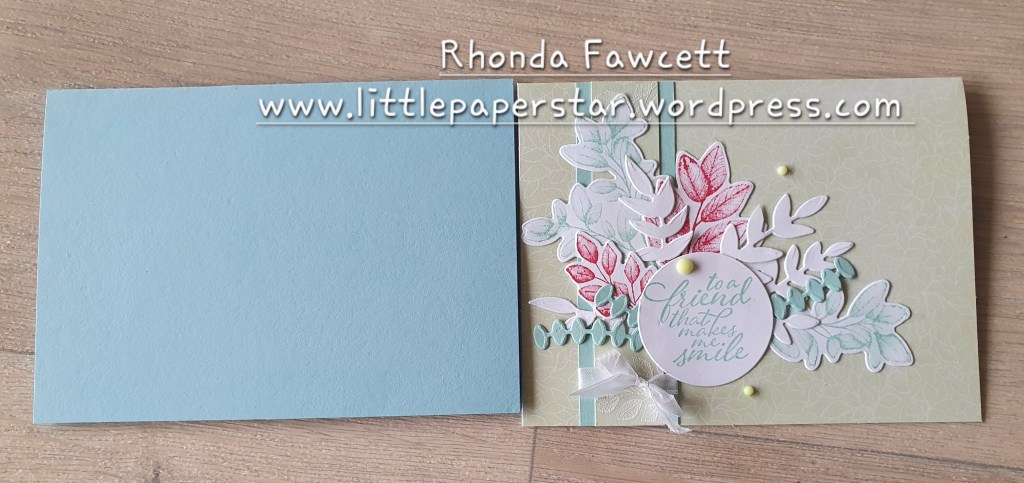
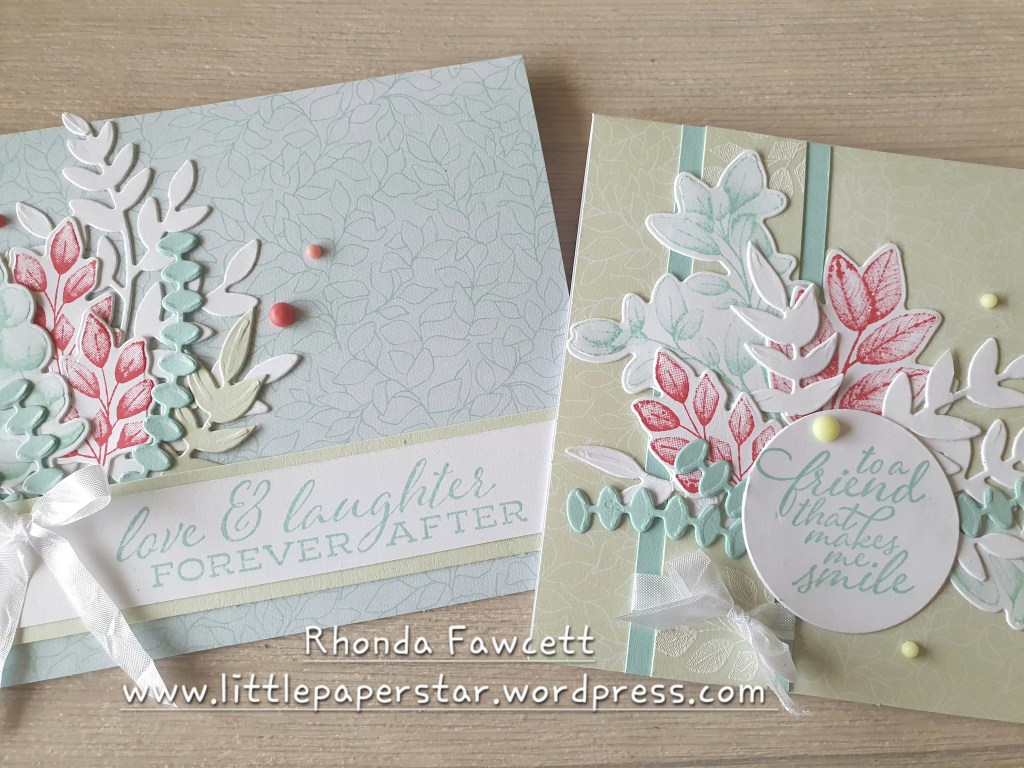
There are 20 cards and 20 envelopes. The envelopes are all the same, in Soft Seafoam with lovely subtle white printing on the front bottom corner and on the envelope flap. Inside the flap is a scattering of pool party small leaf images. There are two different card designs. 10 cards in pool party with a darker pool party leaf background and 10 cards in soft seafoam with a white leaf background. The leaf images coordinate perfectly with the Splendid Day Suite in the annual catalogue.

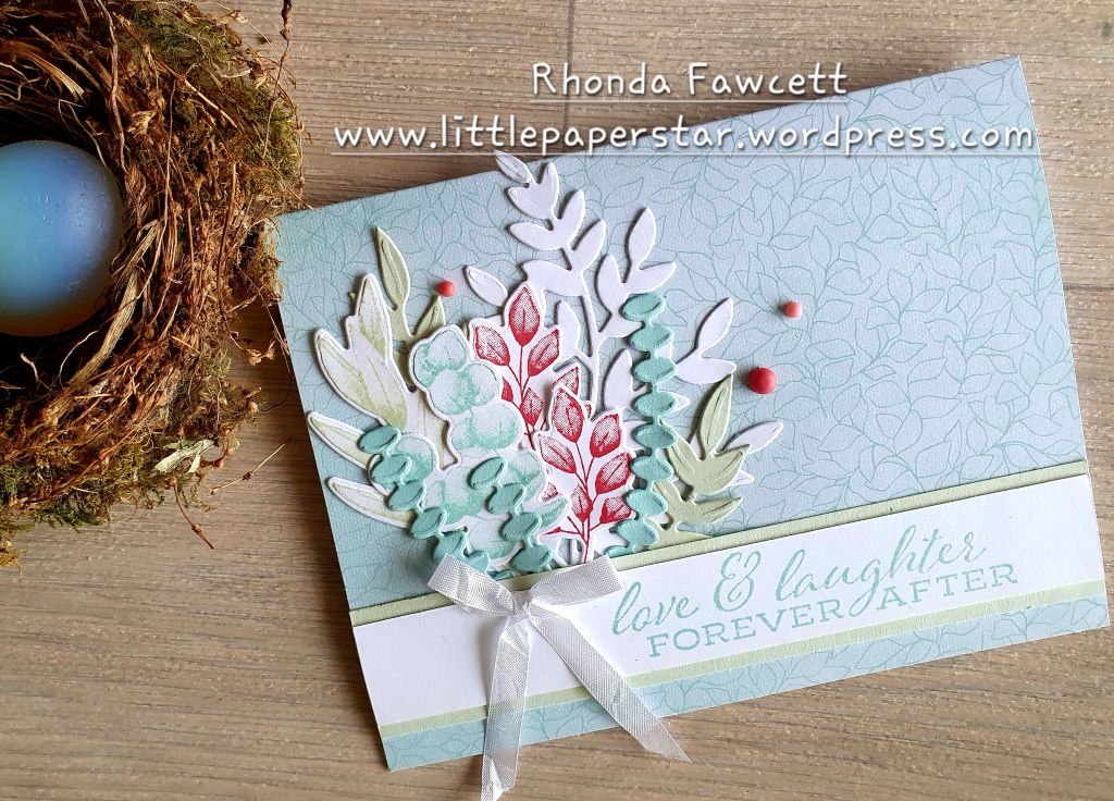
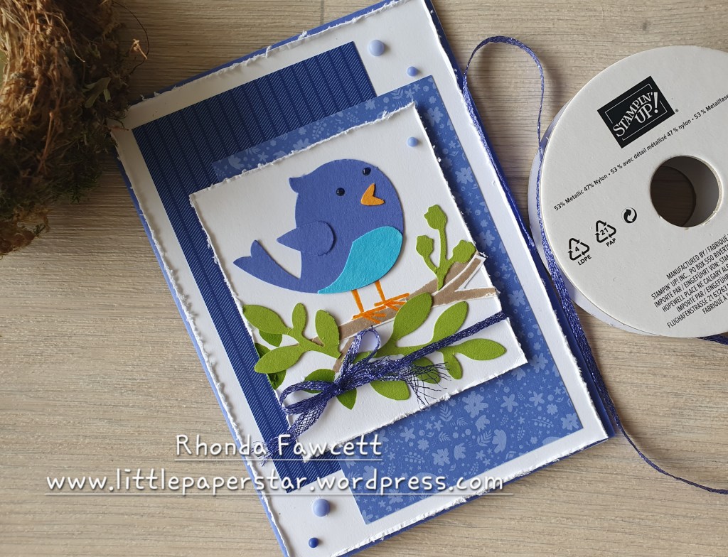
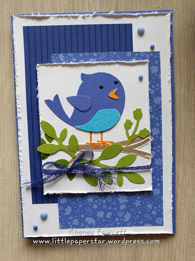
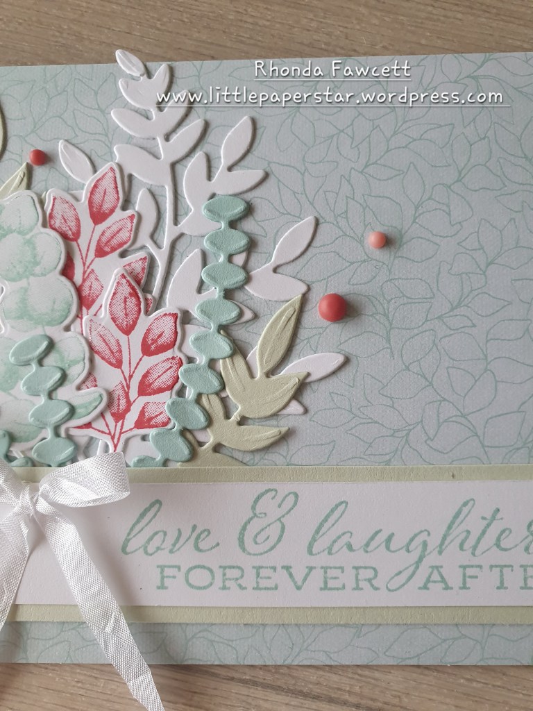
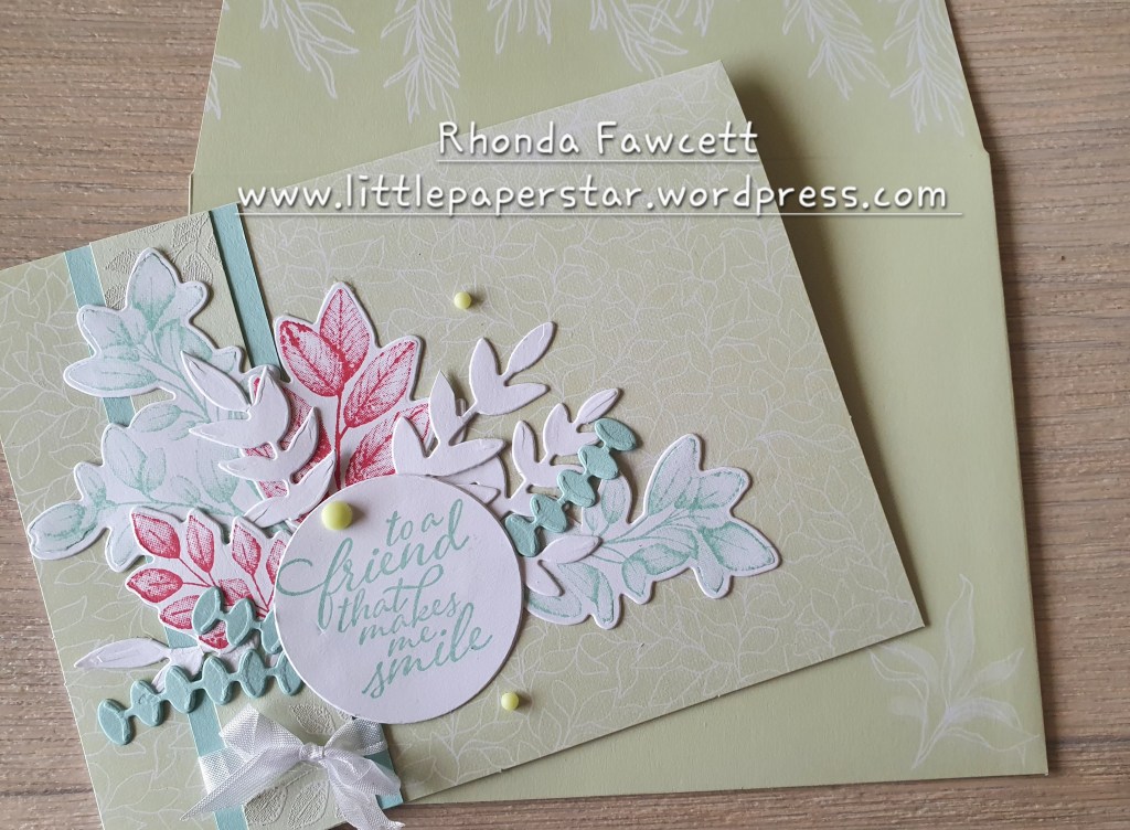
Because I didn’t have the Splendid Day Suite, I decided to use the Forever Ferns bundle. The colours and patterns were delicate and it needed a stamp set that also had delicate leaf designs. I think this bundle worked perfectly. I kept to the colours in the cards but added in Sweet Sorbet to give it a little lift. I used the white seambinding ribbon as it is also soft and delicate.
On the soft seafoam card, I added a little bit of white embossing, just to carry through the white on soft seafoam look.
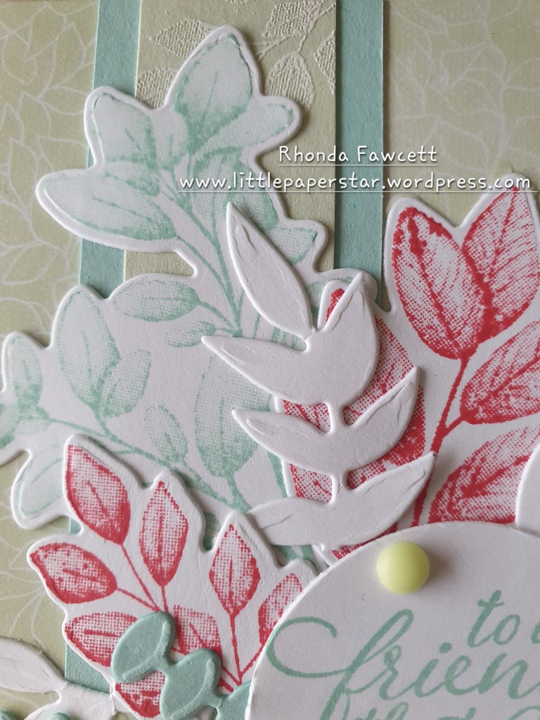
The embellishments I used were the in colour matte decorative dots. All the green dots are technically Parakeet Party in colour but because they are ombre dots, I was able to use the lightest green and it toned in well with the soft seafoam background.

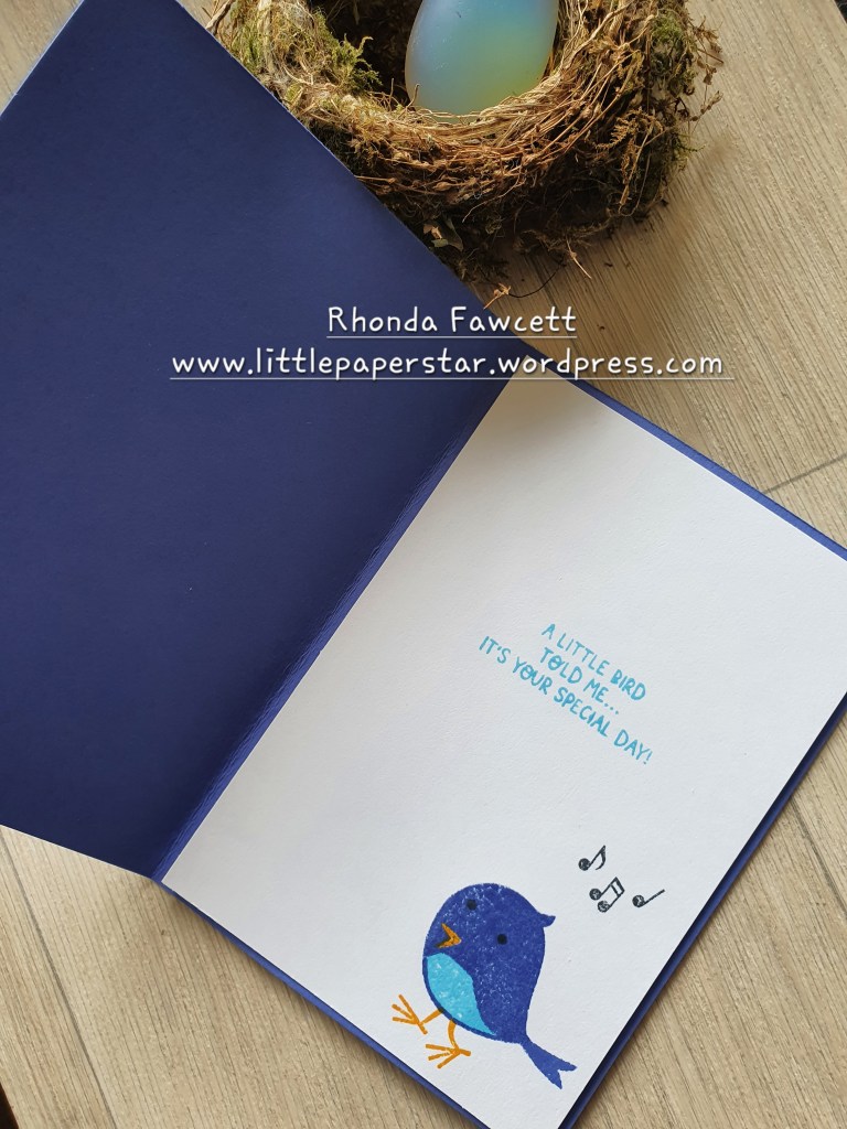
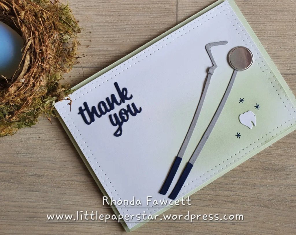
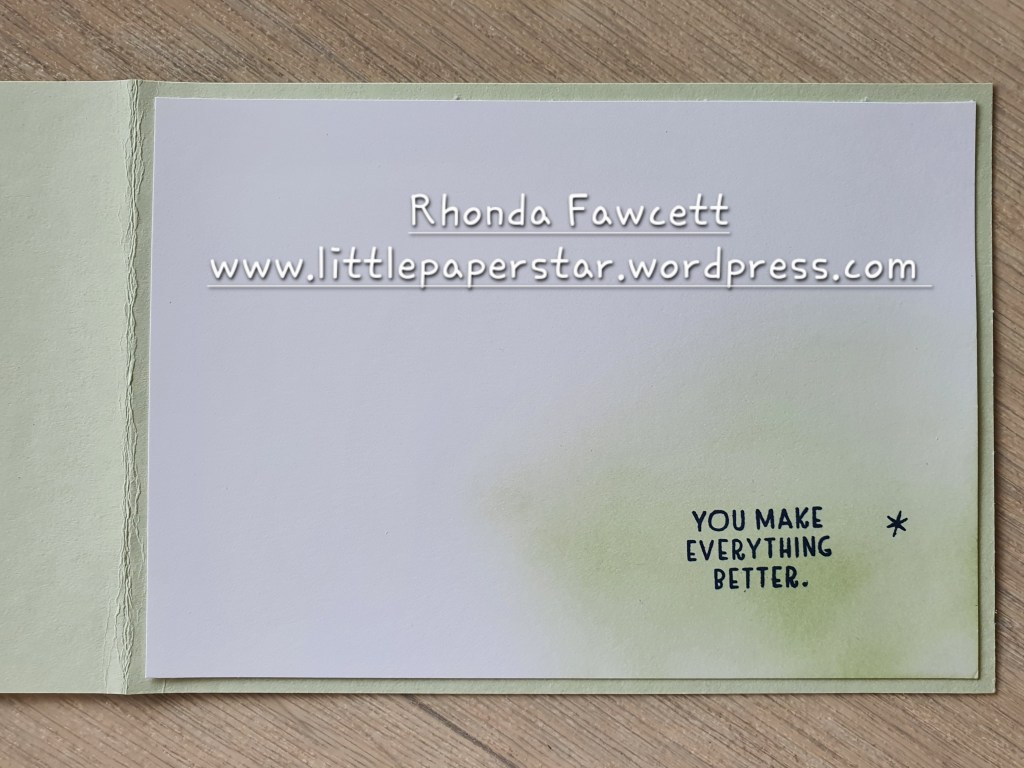
I hope these projects inspired you to give this card and matching envelope set a go. I am certainly happy with how these wedding and thank you cards turned out.
Please click on the links below to see what other sale-a-bration products have been used by the other ladies in our blog hop and don’t forget to leave a comment if you like what you see.
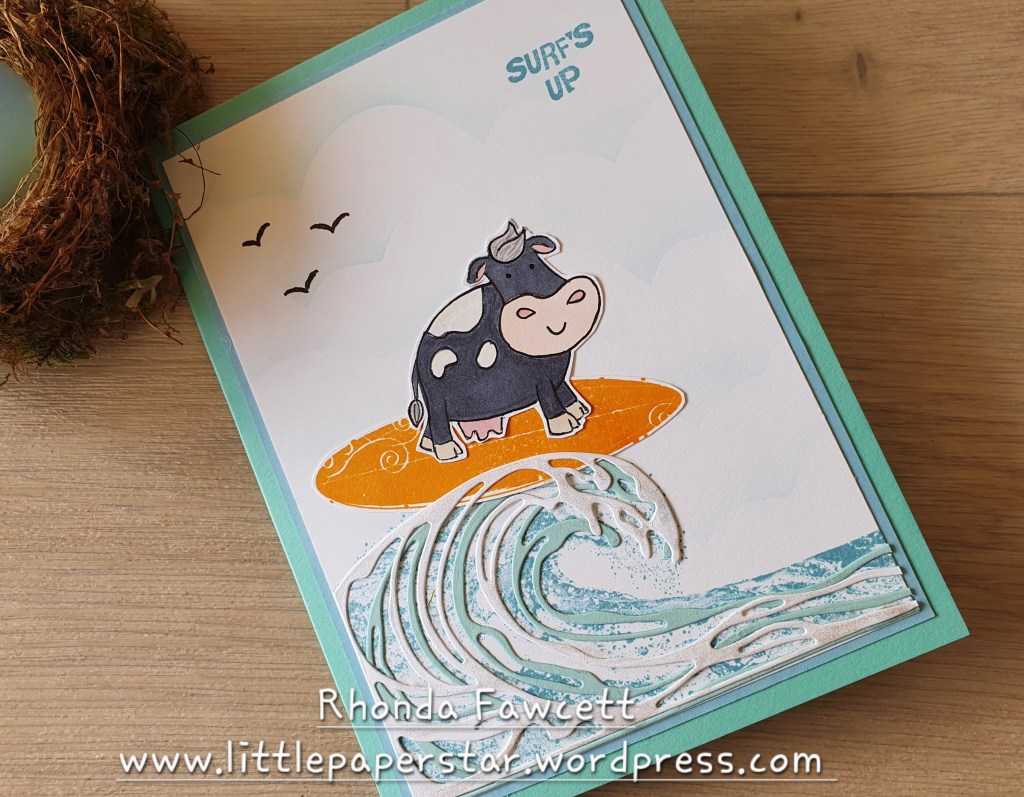
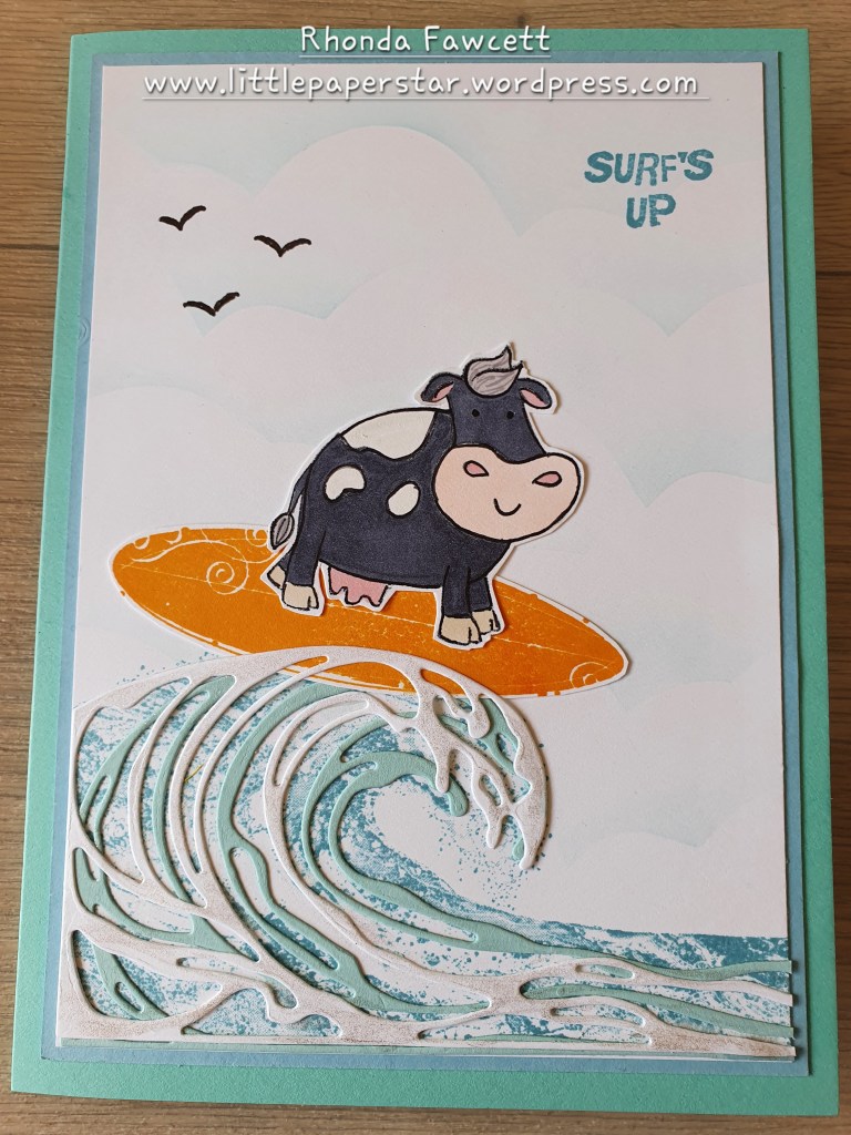
Rhonda Fawcett – Little Paper Star
Deborah Schultz – Handcrafted by Deb
Caroline White – Creations With Caroline