Unknown's avatar

About littlepaperstar

I am a Stampin' Up! Demonstrator based in Matamata, New Zealand. I love all things paper-craft. This is my platform to share ideas and knowledge with others.

He’s the man – Scrapbooking page

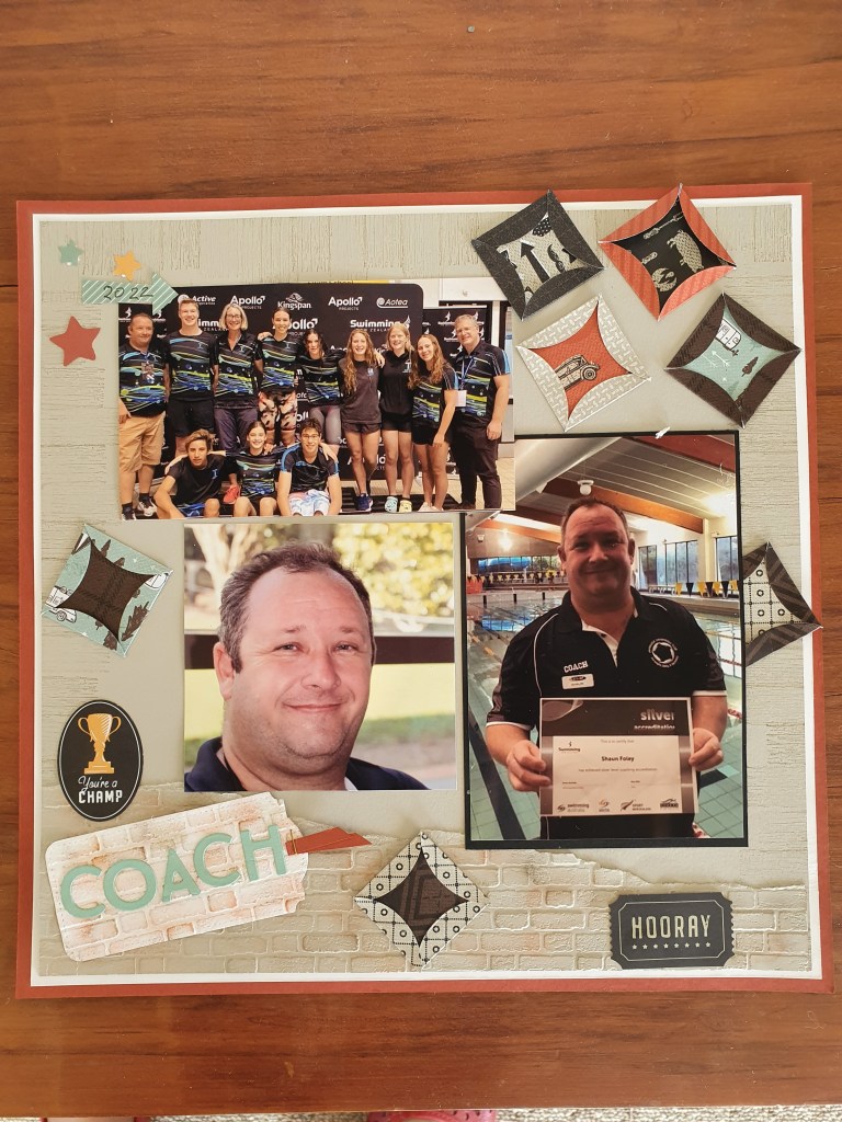
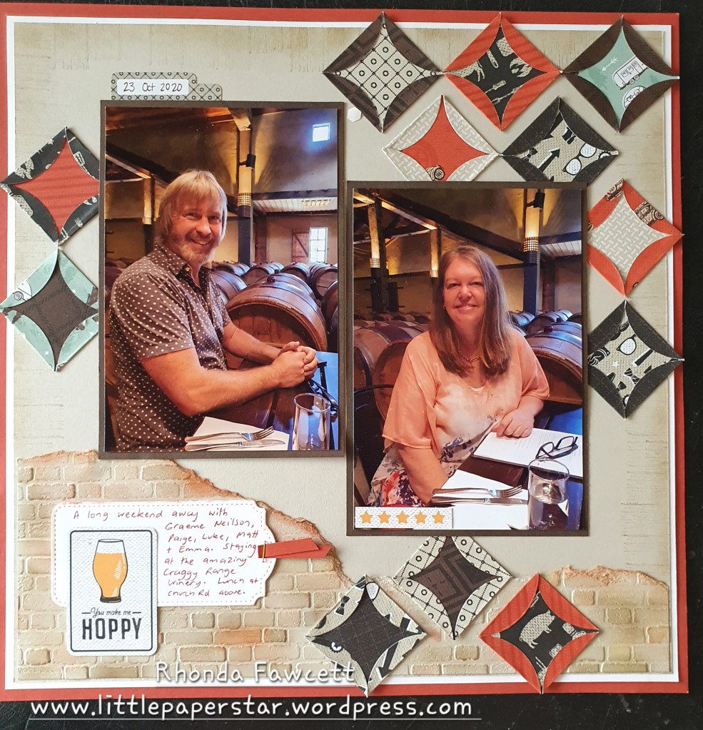
I used the wonderful DSP pack called “He’s the man”, to make this 12 x 12 layout. It uses showcases all the papers from the pack.

I started by stamping and daubering the edges of a 27 x 27 cm piece of Sahara Sand card. I then embossed some smaller pieces of Sahara Sand card with the Brick and Mortar 3D embossing folder and tore the edges of each piece. I daubered the raised areas and the torn edges using Sahara Sand, Cajun Craze and Early Espresso inks. I joined the two embossed pieces together and covered the join with a folded circle shape. I made several more of these shapes to scatter on my layout.

I finished with a tailored tag journal box and some die cut pieces from the “He’s the man” pack. There are die cut pieces for all interests from cars to camping and handyman to hero. I thought this die-cut featuring the beer glass was just perfect for my layout.

My customers usually only make a single 12 x 12 page in class but they often ask me how to do a double page layout. This is a mock up I did as a suggestion for them. Nothing was glued down.

This double page spread had an Early Espresso base instead of Cajun Craze.

I was impressed that my group of ladies all wanted different die-cuts to complete their own pages. There were many different variations to choose from so there was no fighting. Lol.

Here is another example of the layout. This page was made by Wendy Foley. She also used the retired Playful Alphabet dies.

In Colour Blog Hop

Hi and welcome to my blog. I am excited to be a part of this blog hop with some of my fellow South Pacific demo council members from last year. It was a privilege to work with these group and although we only have 3 of us doing the blog hop this time, we hope to have the others join us next time.

This is my first ever blog hop and I am going to show you a project made from my favourite new in colour – Orchid Oasis.

This card features Orchid Oasis cardstock, ink, DSP, ribbon and decorative dots. I used the Sweet Songbirds bundle and the Bough Punch

I started with a folded A5 card base and added a white cardstock layer (14.6 × 10.2 cm), which I distressed the edges of, with my scissors. I then added two pieces of DSP (Designer series paper), both measuring 11.5 x 7 cm. I used Orchid Oasis and Starry Sky. The reason I added in the darker shade is so that it gave more interest and to help it tone in more with the ribbon. Because the ribbon has a metallic sheen to it, it doesn’t match perfectly with the Orchid Oasis card, so I wanted to bring in some more shades of colour.

I then took a white card measuring 8 x 6.5 cm and stamped the birds feet about halfway. I used versamark and Mango Melody ink and heat embossed with clear embossing powder. I did the same with a scrap piece of card. Then I stamped on top of the feet with Crumb Cake ink. The ink didn’t cover the feet. Embossing first causes ink to resist where you have embossed, so the feet still stood out nicely.

I punched out the bird and leaves using Orchid Oasis, Tahitian Tide, Mango Melody and Granny Apple Green card. I distressed the edges again, tied around the ribbon, and added fine tip glue to brighten the eyes. I mounted this to my card base with dimensionals.

I stamped another bird inside along with a sentiment. This was a fairly easy card to make. Embossing the feet was the part that took the longest and in reality that wasn’t even too long. I hope this inspires you to try out some of Stampin’ Up!’s new in colours.

Please check out the rest of the blogs on our blog hop…. Don’t forget to share and comment if you like what you see.

Deb Schultz – Handcrafted By Deb

Caroline White – Creations With Caroline White

Rhonda Fawcett – Little Paper Star

Everyday Heros – A card for my dentist

Stampin’ Up! currently has a campaign on, encouraging people to send a card of appreciation to people who has gone that little extra mile or who have shown kindness to others.

I decided that I wanted to thank my dentist who spend extra time making sure I was happy with all the dental work. She even was prepared to come in on her day off to see me at no extra charge. #EverydayHeros

I was originally going to make a card using the retired Handsomely Suited dies with dental tools poking out of the pocket but yesterday when I was using the hand penned petal dies, one of the inside flower pieces ended up in my lap and it looked just like a tooth. So I made a much simpler card using that. Scroll down to see photo of die, were I got the tooth shape from.

The dies I used were from Paradise Palm bundle, Love you more than bundle and Hand penned petals bundle.

Did you know it is super easy to create thank you using the Love you more than dies? Just die cut “love you more than” and “cookies”. Use the k from cookies and add it to the word than. So easy!

My sentiment for inside the card was from the “Nothing’s better than” stamp set.

Sweet Songbirds

I made this slimline card as an entry into a card challenge. Colour INKspiration # 124. The colours to use were Daffodil Delight, Parakeet Party, Tahitian Tide and Night of Navy. I also used black to stamp the birds eyes and a bit of crumb cake for the branches. To enter this challenge go to Colour INKspiration challenges on Facebook or Instagram #colourinkspirationchallenges

I used my blending brushes to do a lightly sponged background. The clouds were free hand cut from a piece of scrap paper to make a stencil to sponge over. I used a few of the stamps from the Sweet Songbirds stamp set but the main part of the bird is created with the corresponding punch.

The reason I love the punch so much is that I can easily change the orientation of the bird by flipping the card over once I have punched it out.

Let’s set sail.

I had a day in my craft room today, to just play. It is rare these days as mostly I am on a tight time frame to get ready for classes. Anyway I decided to take part in a challenge and I chose a #justaddinkchallenge. It is a colour challenge. #jai608

I certainly picked a hard one. I hardly ever use these colours. And certainly not these four on their own. Anyway after a couple of failed attempts, I finally came up with this card.

Do you like it? I used the stitched rectangle dies, the horizon dies and the sailboat punch. All the stamped images are from the Let’s set sail stamp set. I used Wink of Stella on the reflection of the setting sun over the water. It’s a little hard to see in a photo but looks pretty in real life.

I kept the inside of the card fairly simple.

If you would like to take part in this challenge head over to just-add-ink.blospot.com and have a go.

Happy Forest Friends Suite

As soon as I received my new Annual catalogue, I fell in love with the Happy Forest Friends suite. I couldn’t wait to a have play. Here is one of the cards I made using some of the elements from the suite.

The bear is stamped and die cut out. The background is from the DSP (Designer Series Paper) pack, Happy Forest Friends. The ribbon is also from this suite and it is part of a 2 pack of lovely soft twill ribbon in both Old Olive and Sahara Sand.

This is a great set for baby cards if you want to get away from the traditional blue and pink baby cards. It will also make great birthday cards. I can just imagine the bear holding a balloon. What do you think?

Waves of Inspiration Card

This is a card that I taught in class last week, using one of my new favourite bundles; Waves of Inspiration.

It features an old stamping technique called Kissing Technique. This is where you take a bold image stamp and detailed image stamp. Ink them both up in two different colours. Use a lighter ink colour on the bold image stamp. (I used Balmy Blue on the hello stamp) and use a darker ink colour on the detailed stamp. (I used Pacific Point on the nest stamp, taken from Sweet Songbirds stamp set). Then press or kiss the two stamps together. The darker ink colour will transfer onto your bold image stamp, which you can then press onto your card. I like how this turned out as it gives the impression of waves, in the word “hello”.

I stamped the pelican again inside the card but this time I masked off one of the posts, to give the impression of a rising tide.

Handpenned Petals and Tags

I created this scrapbook page using the Tailor made tags dies and penned flower dies. It also uses the retired papers called “In Good Taste”. If you wanted to make this page, you could use any neutral papers.

When I taught this in class, the ladies didn’t like tying all the bows! 10 of them. I told them practice makes perfect. 🙂

I like to teach new techniques with my layouts and this time, I was teaching distressing with water. The first distressing technique using water was to curl the edges of the paper. We painted the edges of the photo mat paper with a layer of water and then curled the edges up with our thumbs. The water softens the paper so it curls easily and stays that way when it dries.

The second distressing technique using water was to stamp with water. We started with white card and sponged crumb cake ink on top and then inked up our stamp (bold “flower” shape image) using water on a clear block as our ink pad. When the water stamped image touches the card it removes the sponged colour and turns it back to white. We then stamped a bold flower outline on top with Early espresso ink.

I would love some feedback on these techniques. What do you think? Do you like them? Have you tried them before?